
Appearance
🎛️ Rush Grid Container
Overview
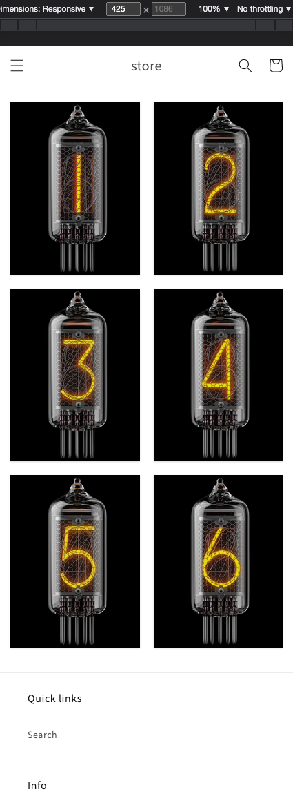
The Grid Container App Block is a versatile container that allows you to organize your layout into a set of rows for different devices such as mobile, tablet, desktop, large, and extra-large screens. This improves the user experience across all devices by letting you display, for example, a single banner on mobile but three banners on desktop screens.
Customization
To customize the Grid Container:
- Click on the Grid Container block in the Shopify editor.
- The settings panel on the left side of the screen will allow you to configure the layout of your page.
Key Configuration Options:
- Number of Columns: Set the number of columns to display on various screens. You can choose between 1 and 6 columns.
- Maximum Width: Configure the maximum width of the container. You can set this as a percentage or a fixed pixel (
px) value. - Visibility: Select when the section is visible using the Visibility dropdown. For example, if you want the grid to be visible only for Pickup ready orders, you can select only that status.
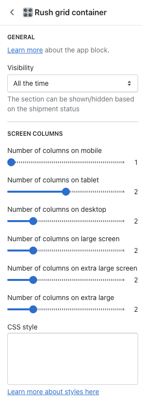
Visibility
You can pick a specific status for which you want the grid to display its content. This helps in targeting specific user actions or order statuses. 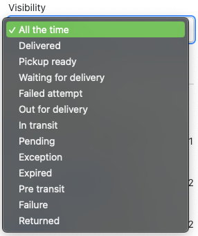
Examples
To better understand how this works, consider the following configurations and how they render on various screen sizes: 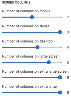
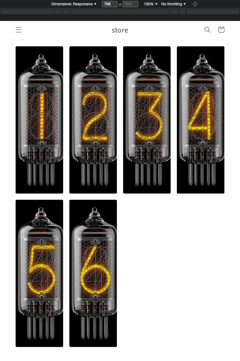
- 425px width (Mobile View): Displays one column.
- 768px width (Tablet View): Displays two columns
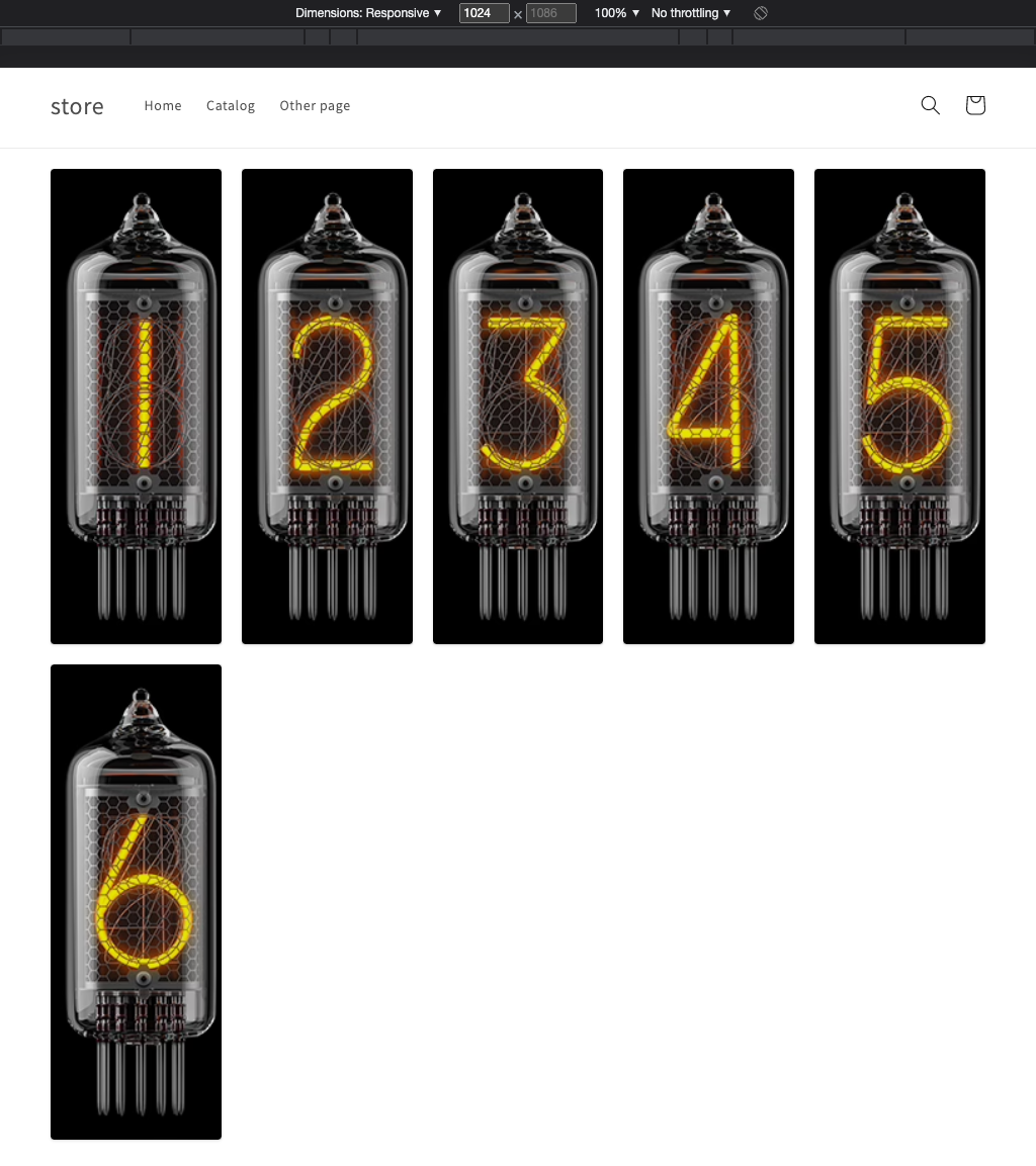
- 1024px width (Desktop View): Displays three columns.
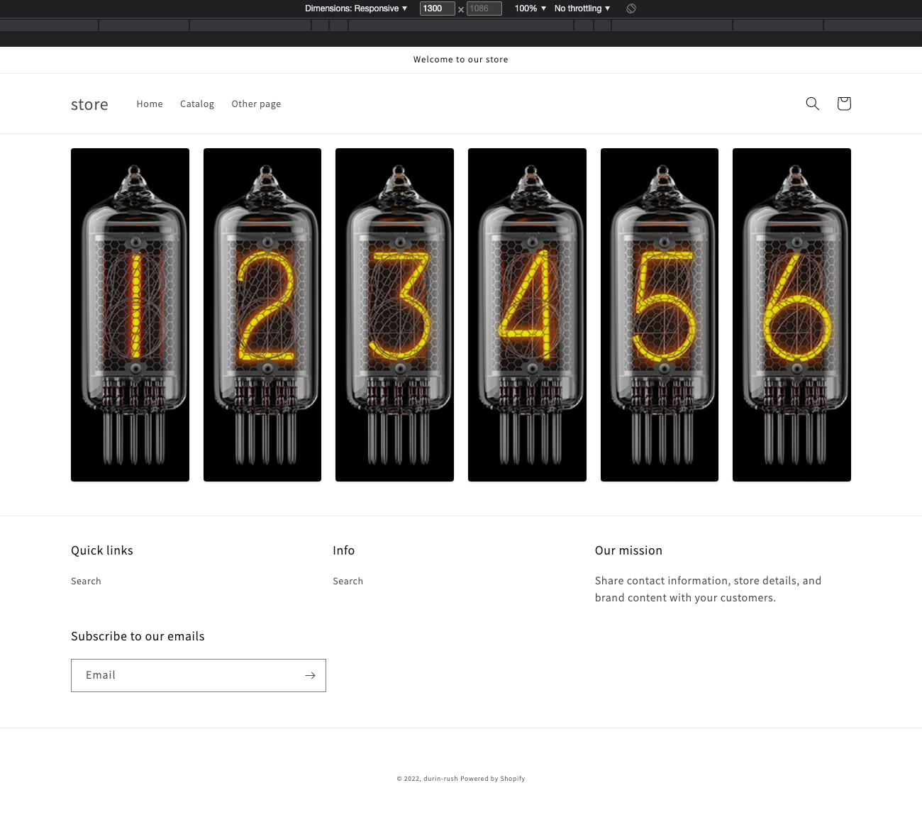
- 1300px+ width (Large Screen View): Displays four or more columns, depending on your configuration.
Editing Breakpoints
You can easily edit breakpoints by modifying the Sections/app-rush-container-grid.liquid file:
- Go to
Shopify Online Store > Themes. - Click on the Actions dropdown on the live theme and select Edit Code.
This file allows you to define custom breakpoints for your grid container, giving you complete control over the layout.
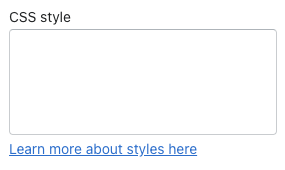
CSS Styling
The Grid Container block includes a CSS style box where you can insert custom CSS to further customize the appearance. This flexibility allows you to tailor the look of your grid container to match your store’s branding.
Styling Example:
Case #1: Set the max width of the section and align it in the center
css
#rush-grid-container-main {
  max-width: 1200px;
  margin: auto;
}