
Appearance
🤑 Cross-Sell Products App Block
Overview
The Cross-Sell Products App Block is designed to enhance customer engagement by showcasing recommended products, collections, best-sellers, and related items. It helps drive additional sales by suggesting relevant products to customers.
Visualization
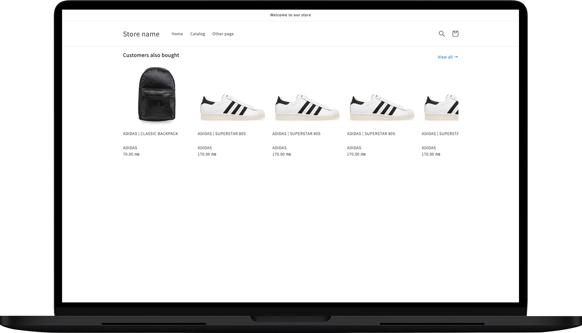
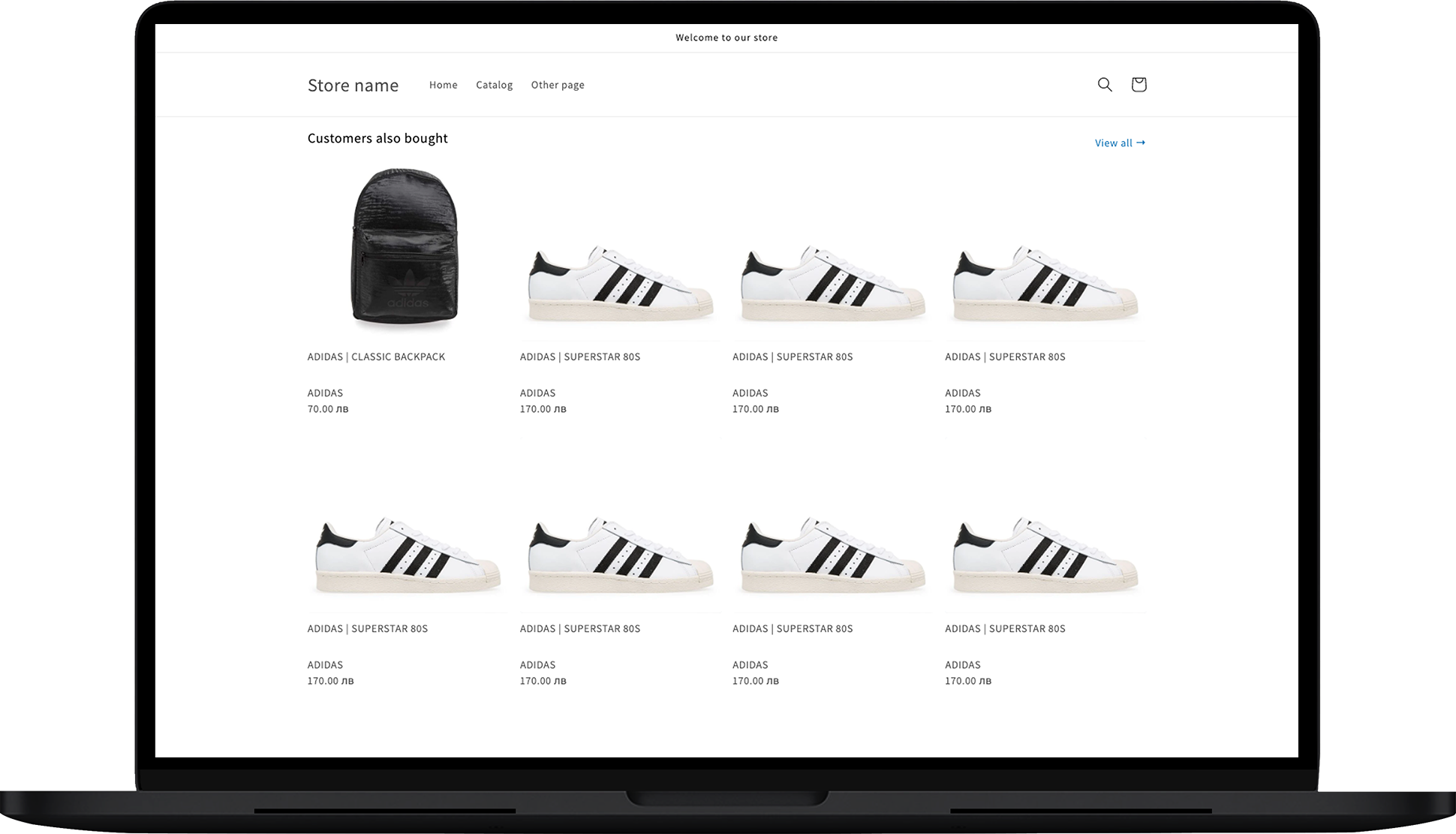
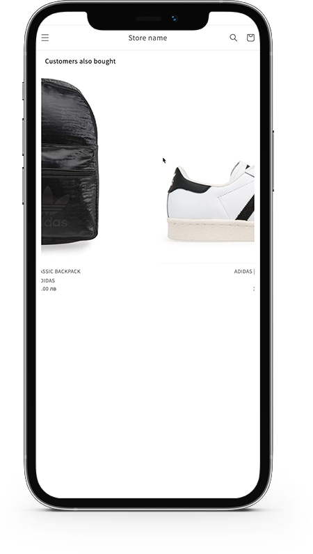
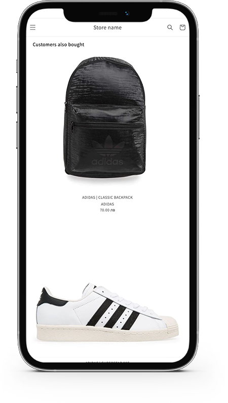
The Cross-Sell Products App Block displays products in different layouts, optimized for various screen sizes:
- Slider Layout (Desktop)
- Grid Layout (Desktop)
- Slider Layout (Mobile)
- Grid Layout (Mobile)
Customization
General Settings
In the General section, you can configure the following settings:
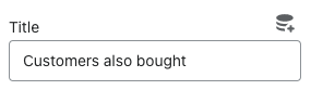
Title:
- Define the title displayed at the top of the cross-sell section.
- Define the title displayed at the top of the cross-sell section.
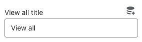
View All Title:
- Set a title for the "View All" link, guiding customers to a complete collection. Examples include "View All" or "See Collection."
- Set a title for the "View All" link, guiding customers to a complete collection. Examples include "View All" or "See Collection."
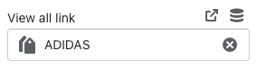
View All Link:
- Specify the URL customers will be redirected to when they click the "View All" link.
- Specify the URL customers will be redirected to when they click the "View All" link.
Source
Configure the source of products to be displayed:
List Source:
- Choose the source of products from the following options:
- Rush Upsells & Cross-Sells: Products based on Rush upsell and cross-sell configurations.
- Pick Products: Manually select products to display in the block.
- Collection: Choose a dynamic collection that automatically updates based on inventory. Avoid static collections with out-of-stock items.
- JSON Source: Link to an external JSON file with a specified format for pulling products. [JSON Format Link]
- Choose the source of products from the following options:
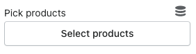
Pick Products:
- Select specific products for display by clicking on "Select Products."
- Select specific products for display by clicking on "Select Products."
Pick Collection:
- Choose or remove a product collection by clicking on "Select Collection."
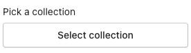
- Choose or remove a product collection by clicking on "Select Collection."
JSON Source:
- Provide a link to a JSON file for dynamic product fetching by clicking on the JSON source box.
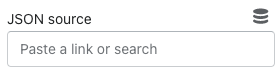
- Provide a link to a JSON file for dynamic product fetching by clicking on the JSON source box.
Layout
Organize the displayed products with the following options:
Layout:
- Choose between:
- Slider
- Grid
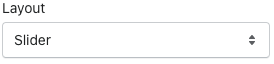
- Choose between:
Maximum Products to Show:
- Set the maximum number of products to be displayed.
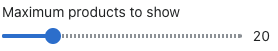
- Set the maximum number of products to be displayed.
Click Action:
- Define the action performed when a product image is clicked: - Go to Product Page (PDP): Redirect to the product detail page. - Add to Cart: Automatically add the item to the cart (if available). - Buy Directly: Add the item to the cart and redirect to the checkout page.
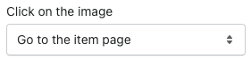
- Define the action performed when a product image is clicked: - Go to Product Page (PDP): Redirect to the product detail page. - Add to Cart: Automatically add the item to the cart (if available). - Buy Directly: Add the item to the cart and redirect to the checkout page.
Style
Customize the visual appearance of the app block:
Title Text Color:
- Set the color for the title text of the products.
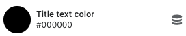
- Set the color for the title text of the products.
View All Color:
- Define the color for the "View All" text.

- Define the color for the "View All" text.
View All Hover Color:
- Choose a hover color for the "View All" text.

- Choose a hover color for the "View All" text.
CSS Style:
- Add custom CSS for further styling. Use the
.rush-product-listclass for customization.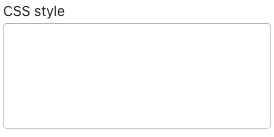
- Add custom CSS for further styling. Use the
Styling Cases
Case #1: More Images Displayed
css#rush-product-list { max-width: 1000px !important; margin: auto; margin-bottom: 35px; margin-top: 35px; } .R-upsell-container { min-width: 14rem; } .R-product-img { min-height: auto; } .productlist-header { font-size: 26px; font-weight: bold; }Case #2: Remove/Hide Vendor Name
css
.R-upsell-container {
  min-width: auto;
}
.productlist-header {
  font-size: 20px;
  font-weight: 600;
  margin-bottom: 4px !important;
}
@media only screen and (max-width: 480px) {
  .scroll-container .R-grid-cols-1 {
    grid-template-columns: repeat(2, minmax(0, 1fr)) !important;
  }
  .R-product-img {
    min-height: auto !important;
  }
}
.R-upsell-container p.R-mt-1.R-text-sm {
  display: none;
}- Case #3: Adjust Header/Title Size
css
.productlist-header {
  font-size: 22px;
  font-weight: 600;
}