
Appearance
⏳ Loader App Block
Overview
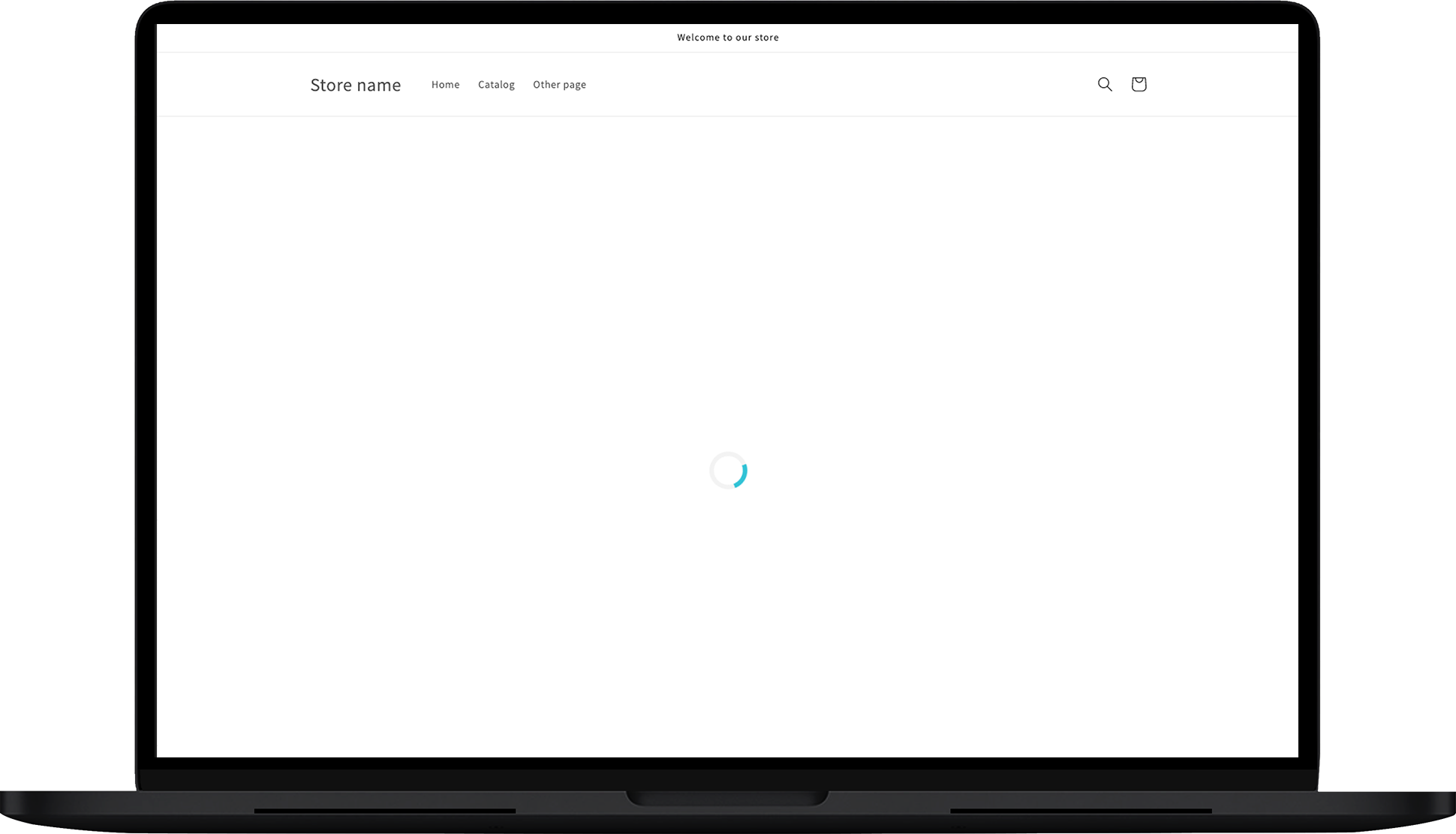
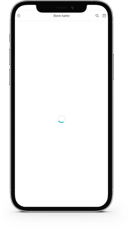
The Loader App Block displays a loading icon while your page is loading. This ensures that your customers do not see a blank page while waiting for the tracking page or shipment results to appear. The loader icon will be shown until either:
- The tracking page is fully loaded and the 🔎 Search Box is visible.
- The tracking page is fully loaded and the shipment information is displayed.
Customization
You can customize the Loader App Block in the following ways:
General
In the GENERAL section, you can adjust the colors used in the loader:
- Primary Color: The color of the rotating part of the loader.

- Secondary Color: The background color of the loading icon.

Here is the preview of the setup of the color:

Style
The STYLE section allows you to apply custom CSS styling. You can reference the CSS by targeting .rush-loader-main.
CSS Styles
You can insert custom CSS in the CSS style box to adjust the appearance of the loader. 
Styling Cases
Here are some common styling scenarios:
Case #1: Push the block 125px down from the tracking page
css
.rush-loader-main {
  padding-top: 125px;
}
Case #2: Center the loader in the middle of the page
css
.rush-loader-main {
  height: 80vh !important;
}
Case #3: Apply opacity to the loading icon
css
.rush-loader-main {
  opacity: 0.5;
}
Case #4: Make the loader icon invisible
css
#rush-loader .loader {
  position: relative;
  opacity: 1;
}
Limitations
The Loader App Block should only be used in conjunction with the 🔎 Search Box. Shopify’s page editor allows multiple loading components, but we recommend using only one per page to avoid conflicts.