Overview
The grid container app block is a container that allows you to organize the layout in a set of rows per device like mobile, tablet, desktop, large, and extra large screens. This is to improve the user experience across all devices. This means that you can display a single banner for mobile, but have 3 banners for desktop resolution pages.
Customization
- Click on Grid container and the settings panel on the left side of the screen will allow you to configure the layout of your page.
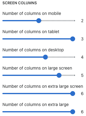
- You can set the number of columns to display on various screens.
- The minimum number of columns is 1 and the maximum is 6.
- You can configure the maximum width of the container. It can be a percent or a px value;
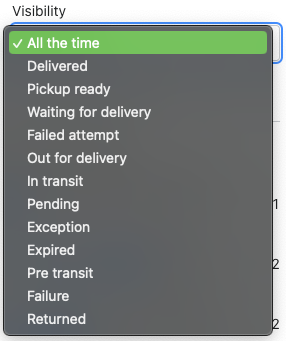
- You can also select when the section is to be visible. based on the Visibility drop-down. If you want to be visible only for Pickup ready orders - you can select only that status.
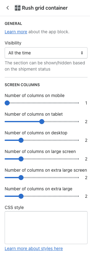
Visibility
Pick the specific status you want the grid to show for its content.
To understand it better, let's see it in action. Results with the following configuration:
Renders as:
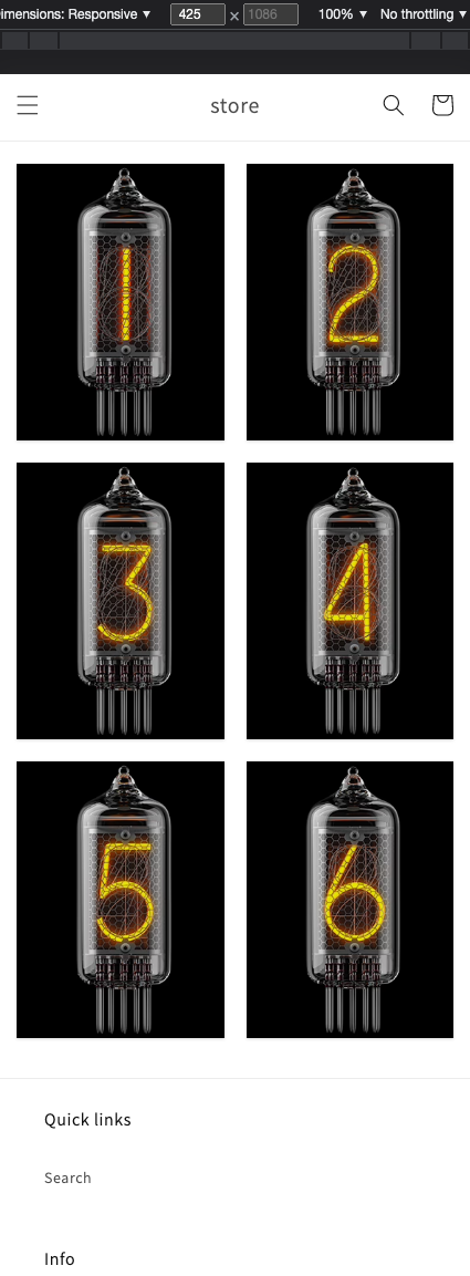
425px width
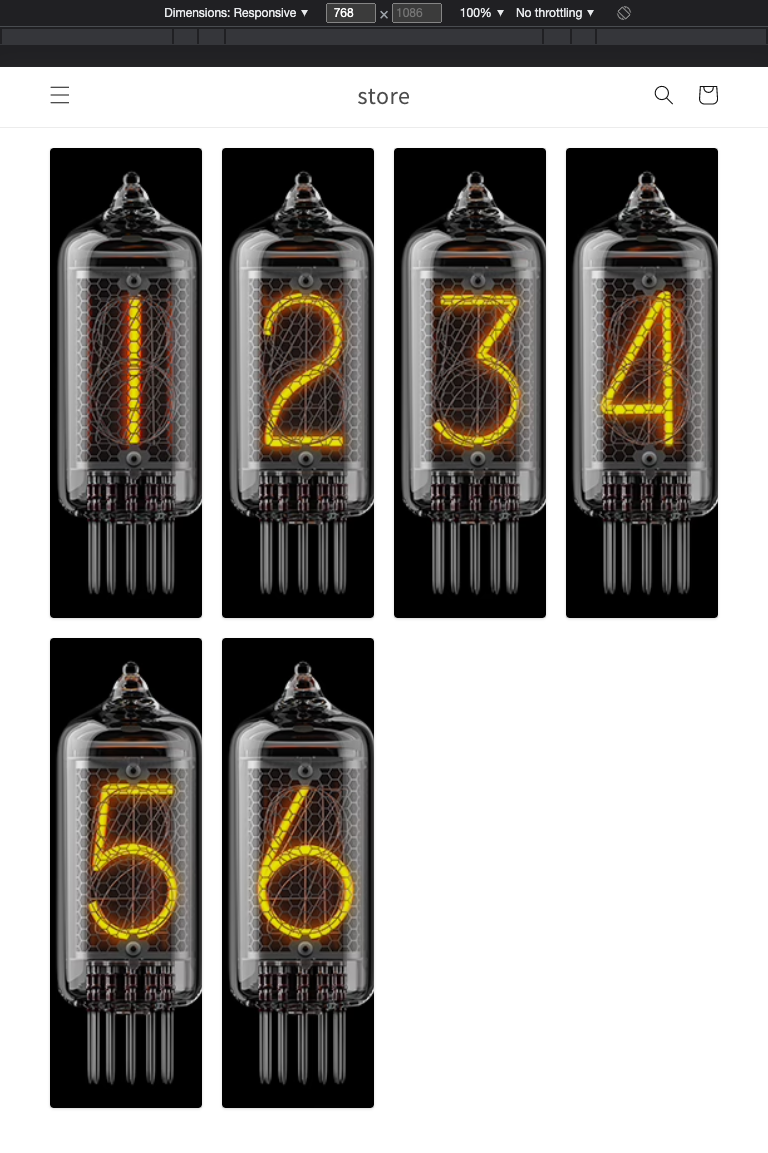 768px width
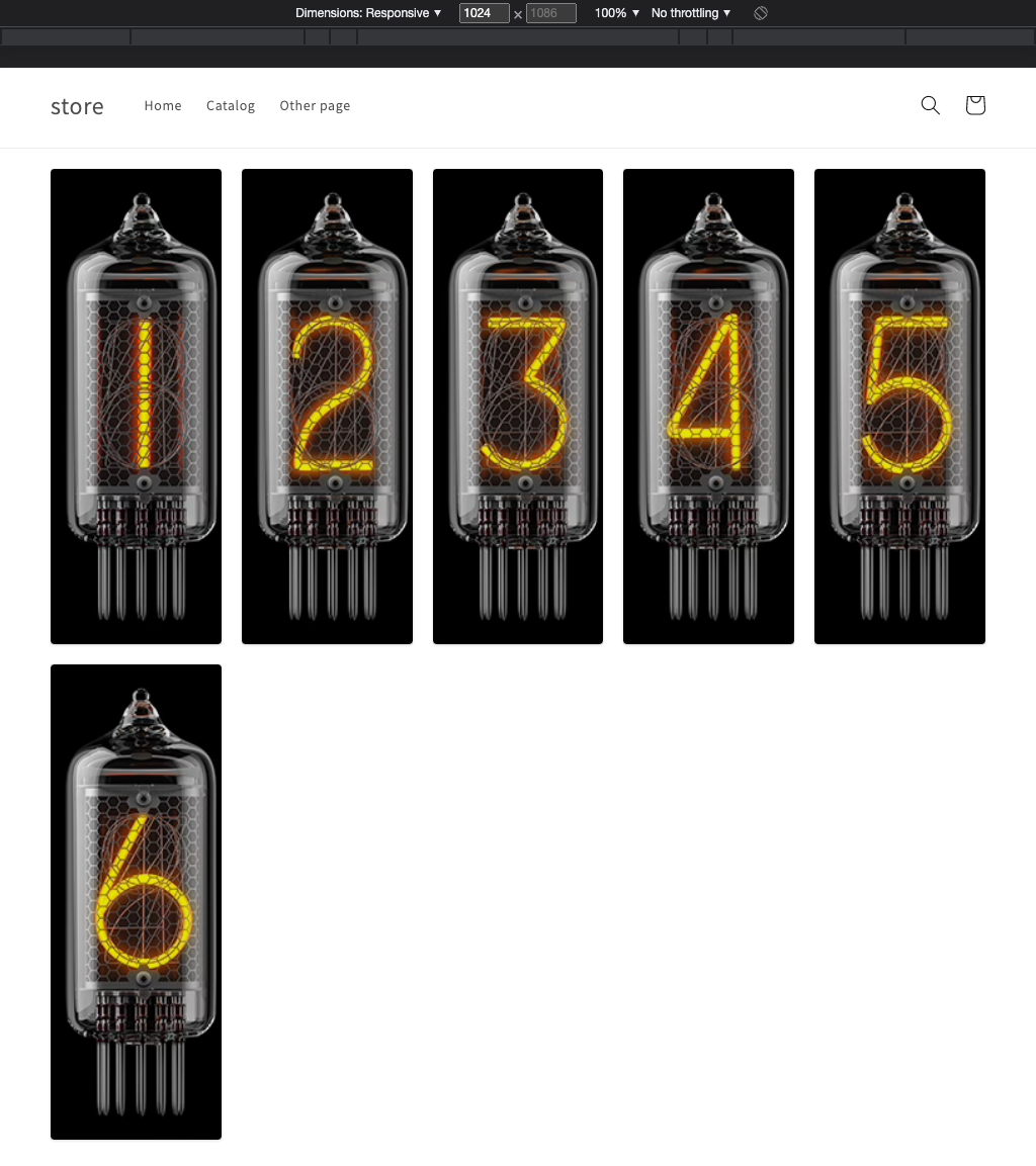
1024px width
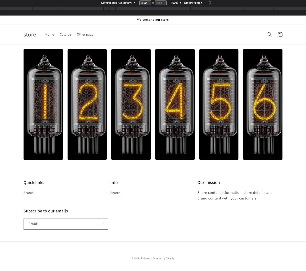
1300px+ width
You can easily edit breakpoints in the Sections/app-rush-container-grid.liquid file.
-
You can do that by going to Shopify Online Store > Themes.
-
Click on the Actions dropdown on the live theme and select Edit Code.
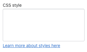
CSS style
This box allows you to insert custom CSS and further customize the announce bar.
Styling cases
Here are a few styling cases:
Case #1
Set the max width of the section and align it in the center
#rush-grid-container-main {
    max-width: 1200px;
    margin: auto
}
Contact us
Feel free to contact us for more information.