Overview
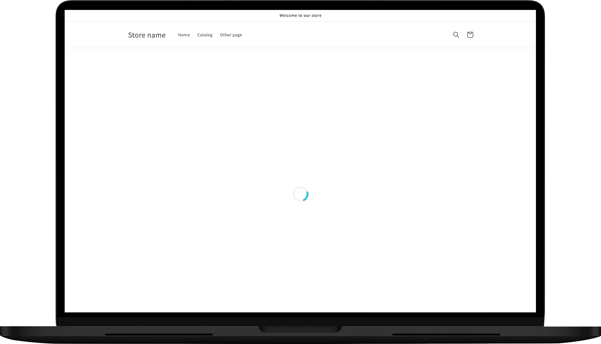
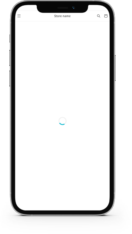
This app block shows a loading icon when the page is loading. This way, your customers don’t have to see a blank page while waiting for the tracking page or shipment results to be shown.
The loader icon is displayed on your page, by default. The app element is hidden as soon as these two things happen:
- The tracking page is loaded, and the 🔎 Search box is shown.
- The tracking page is loaded, and the shipment information is shown.
Customization
Let’s see what can you customize in this app block:
General
In the GENERAL section, you can customize the colors as required.
Primary color
The collared part rotates in the loader.

Secondary color
The background color of the loading icon.

Here is the preview of the setup of the color:

Style
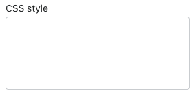
This section allows you to use custom CSS styling. You can refer to items in the CSS by .rush-loader-main
CSS Styles
The CSS style box allows you to insert custom CSS.
Styling cases
Here are some common styling cases:
Case #1
Pushing block 125px down of the tracking page
.rush-loader-main {
      padding-top: 125px;
}
Case #2
Show loader middle of the page
.rush-loader-main {
      height: 80vh !important;
}
Case #3
Apply opacity to the loading icon
.rush-loader-main {
      opacity: 0.5;
}
Case #4
Loader icon not visible
Loader -invisible
#rush-loader .loader {
position: relative;
opacity: 1;
}
Limitations
- This element should be used only with the 🔎 Search box
- Shopify page allows you to add multiple loading components. However, we suggest you have only one per page.
Contact us
For information and feedback, feel free to reach out to us.